(no subject)
May. 30th, 2009 12:38 amI probably didn't mention that I took the Advanced Photoshop course at UMass Lowell this past semester.
It's been srsly 2½ years since I was in the classroom, but I'm in no tearing hurry to finish this certificate, since I'm unlikely to end up as a Professional Graphic Designer. I'm doing this for myself, and I've been waiting for a long time for this course to be offered. The couple times I've seen it offered, it's been cancelled before the beginning of the semester, so I was a little surprised when they actually went through with it.
Anyway, the first project, back in February... I don't remember what the nominal assignment was, since the instructor said we could really do anything; the "assignment" was for those who didn't have any better ideas.
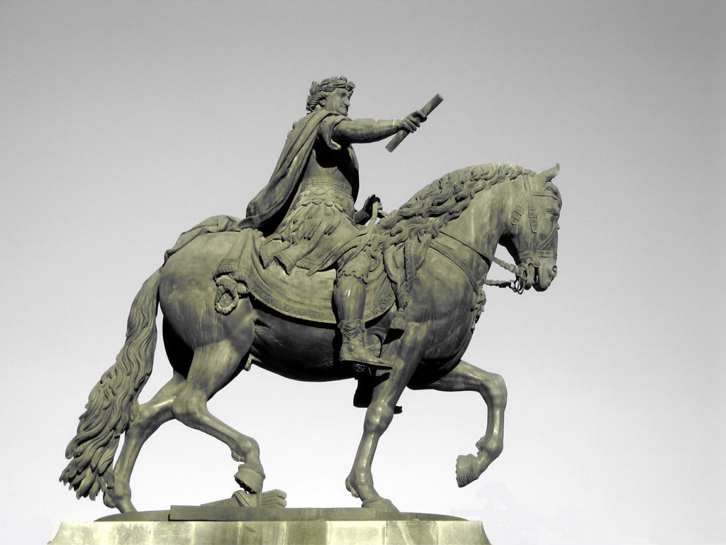
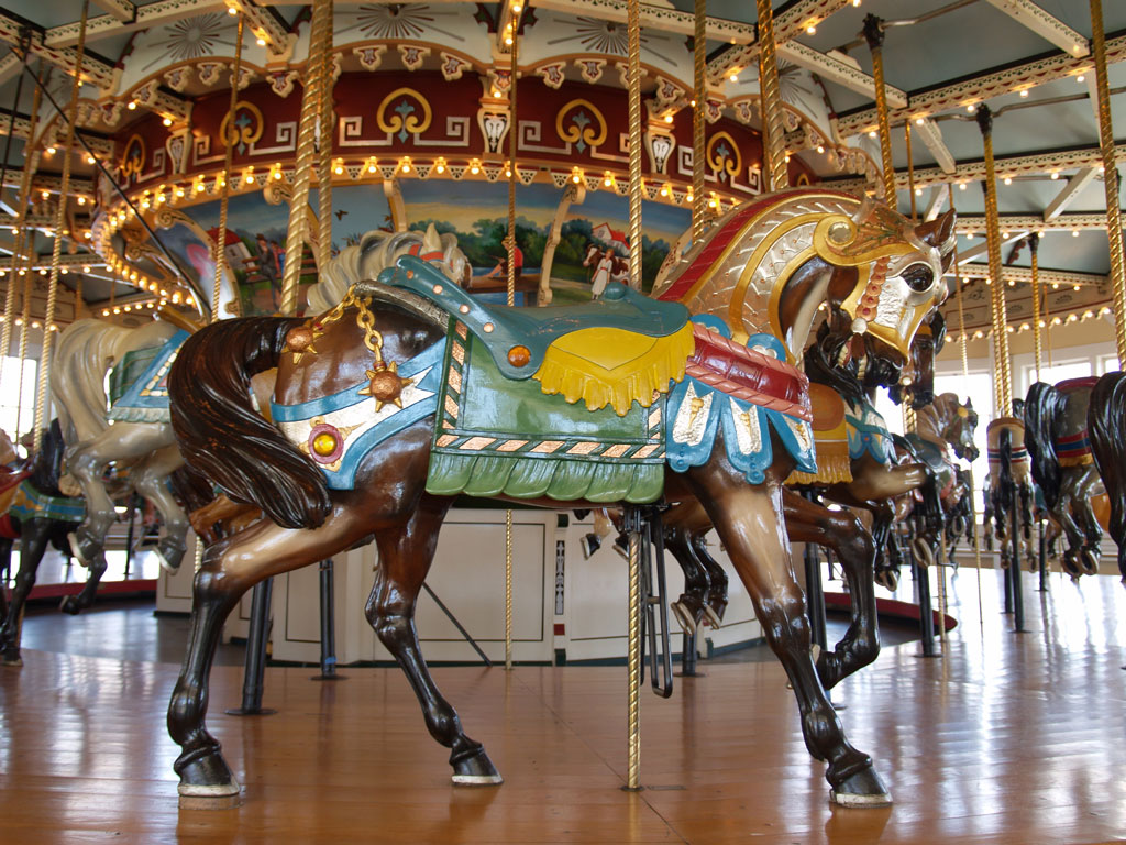
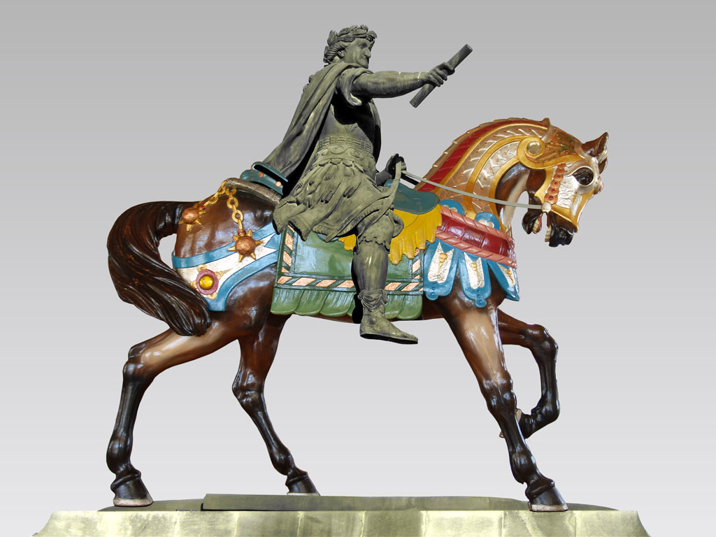
So... this plus that equals the other (clicky for bigger):


According to my sources, the statue is "Spanish King Charles IV, by Tolsa, at Mexico City." I'm a little out of the carousel scene, and the original photographer didn't note anything about it, but I'm guessing Denzel or PTC, from the 20's.
Once I had the concept, it took a while to find appropriate source images. Equestrian statues are all over the place (I really wanted to use Paul Revere from the eponymous park, or George Washington from the Boston Common), but they're usually on a pedestal, thus photographed from below, at an angle, often in very harsh light - lots of highlights, lots of shadows. OTOH carousel horses are usually photographed by mom & dad, from level or slightly above, under a bazillion indoor lights - some highlights, no real shadows. Perspective and lighting, the two big issues for every photoshop chop.
If I were doing this over, I'd make the rider a little bigger in relation to the horse. In the original statue, he's on a freaking war-horse, while the carousel horse is modeled on a light riding horse. The pedestal and the sky are kind of lame, but they were in the original. I drew in new reins, and cut off the rider's left foot, but the big issue is the shadows. I carried some over with the rider, and drew in a few on the horse, but there should be more shadows on the horse. Oh well. It was good enough for an A on the assignment, but it wouldn't win a prize on Worth1000.
It's been srsly 2½ years since I was in the classroom, but I'm in no tearing hurry to finish this certificate, since I'm unlikely to end up as a Professional Graphic Designer. I'm doing this for myself, and I've been waiting for a long time for this course to be offered. The couple times I've seen it offered, it's been cancelled before the beginning of the semester, so I was a little surprised when they actually went through with it.
Anyway, the first project, back in February... I don't remember what the nominal assignment was, since the instructor said we could really do anything; the "assignment" was for those who didn't have any better ideas.
So... this plus that equals the other (clicky for bigger):
According to my sources, the statue is "Spanish King Charles IV, by Tolsa, at Mexico City." I'm a little out of the carousel scene, and the original photographer didn't note anything about it, but I'm guessing Denzel or PTC, from the 20's.
Once I had the concept, it took a while to find appropriate source images. Equestrian statues are all over the place (I really wanted to use Paul Revere from the eponymous park, or George Washington from the Boston Common), but they're usually on a pedestal, thus photographed from below, at an angle, often in very harsh light - lots of highlights, lots of shadows. OTOH carousel horses are usually photographed by mom & dad, from level or slightly above, under a bazillion indoor lights - some highlights, no real shadows. Perspective and lighting, the two big issues for every photoshop chop.
If I were doing this over, I'd make the rider a little bigger in relation to the horse. In the original statue, he's on a freaking war-horse, while the carousel horse is modeled on a light riding horse. The pedestal and the sky are kind of lame, but they were in the original. I drew in new reins, and cut off the rider's left foot, but the big issue is the shadows. I carried some over with the rider, and drew in a few on the horse, but there should be more shadows on the horse. Oh well. It was good enough for an A on the assignment, but it wouldn't win a prize on Worth1000.